
For my creative media graphics sector I created a teaser poster of a film I have created. The software used to create this was adobe Photoshop. I used several steps to create this poster.
My first step was to find an image of the internet, I did this by using Google search. The second step was to create a landscape format on Photoshop. I did this my making the width coordinates wider. After opening Photoshop I downloaded an image of a black background of the internet and opened it into the background layer of Photoshop. I then opened up a new layer over the background where I placed the smoke effect. I used the smoke because it makes the title stand out more and it also fits with the "Crime/Gangster" film genre, the smoke in this posts gives the audience a feeling of mystery and gives the audience a interpretation of the perils that the characters may face. Next I created a new layer and added the gun, I used this object for my teaser poster, because it clearly represents the crime genre. Now all my imagery was in place, I inserted the text into the poster. For the films title I used the text tool and choose the font 'corlone' which I downloaded of www.DaFont.com, I used this font because it is frequently used in the crime drama gerne, and gives the interpretation of a Italian background. I then added the poster blurb which I downloaded of 'cloud drive' and open into Photoshop, after editing the text with the text tool, I moved the text into layer of the poster. The poster blurb is used on to credit the work of the people in the key job roles of this film. Poster blurbs are also commonly found at the bottom of the film's poster. An image of a object that is related to a theme, such as the gun on this poster is called iconography in the media industry.
Mistakes/improvements:
After completing the design of this poster, I can recognise the mistakes I have made in comparison too real teaser posters. One of the mistakes I made was using the scale tool to minimise my text, this makes the text seem squashed. I think the gun on my poster needs to fade in more with the smoke background, in comparison to a real poster it feels out of place.
----------------------------------------------------------------------------------------------------------------------
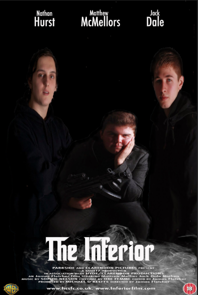
The next task in my graphics sector was to design a theatrical poster for my film. In this evaluation I will discuss the steps made into creating my film poster.Mistakes/improvements:
After completing the design of this poster, I can recognise the mistakes I have made in comparison too real teaser posters. One of the mistakes I made was using the scale tool to minimise my text, this makes the text seem squashed. I think the gun on my poster needs to fade in more with the smoke background, in comparison to a real poster it feels out of place.
----------------------------------------------------------------------------------------------------------------------
My first step was to take photographs. For editorial reasons I used a white screen. This was because I could change the background with the colour range tool. I then opened the photographs into Photoshop.
Once I opened the photographs into Photoshop, I unlocked the background layer and used the colour range tool to edit the out the background in the photographs.
The next task was to create the background, which I downloaded off Google images and opened it up into Photoshop and placed the image into the background layer and places the edited photographs in the layers above.
Now the background was in place, the next step was to fit the characters into the poster. I did this by using the scale tool. The characters poses are inspired by the poster for the film "GoodFellas" which I have analysed for my poster analysis.
http://jimfletch.blogspot.co.uk/2014/10/poster-analyise.html
I then created shadows around the characters, this was inspired by the posters for "The Godfather" and "Goodfellas". For this task I used the paintbrush tool, and coloured around the characters face and body, like the poster for "The Godfather" I used the shadows to suggest that the characters are mysterious.
My next step was too add the smoke effect, to achieve this I used the screen shot I used for my teaser poster. I opened the image in Photoshop and used the magic wand tool to edit the black background out. I then moved the image into a new layer above the previous images used on the poster.
After inserting most of the imagery into my poster, I then moved on to editing text into my poster. For the title and name tags on this poster, I used the text tool and used the Corleone font because it fits with my posters crime/drama theme, this font is also inspired by "The Godfather" poster. After editing the text, I used the scale tool to edit the size of the text. The name tags above the actors on my poster was inspired by the "Goodfellas" poster.
For the credits used on my poster, I downloaded the image of cloud drive and uploaded it into Photoshop. I then edited the text with the text tool and added my name and the name of the actors into the poster blurb. I then moved the text onto my poster layer. and sized the text with the scale tool.
After editing the text I used the warner brothers logo which I downloaded of Google images. I then opened the image into Photoshop and used the magic wand tool to edit out the background. Then I moved the logo in a new layer above the previous images onto Photoshop. I used the scale tool to edit the size of the image.
The final task was to upload the BBFC 18 certifiacte onto Photoshop, which I made a screen shot earlier for my poster proposal. I then opened the screenshot onto Photoshop and used the magic wand tool to edit out the background. And then moved the image onto a new layer on Photoshop.
Mistakes/Improvements
When I used the paintbrush tool to create a shadow effect, I used it in the background layer, this made it difficult to edit or remove the effect without disturbing other images. To avoid this next time I will need to open a new layer when using the paintbrush tool. And also I will need to create new layers for each individual edits I make with the paintbrush tool.
No comments:
Post a Comment